


2024 – CHW
To Belvoir Castle to look at some planting plans for next spring with the new Head Gardener.
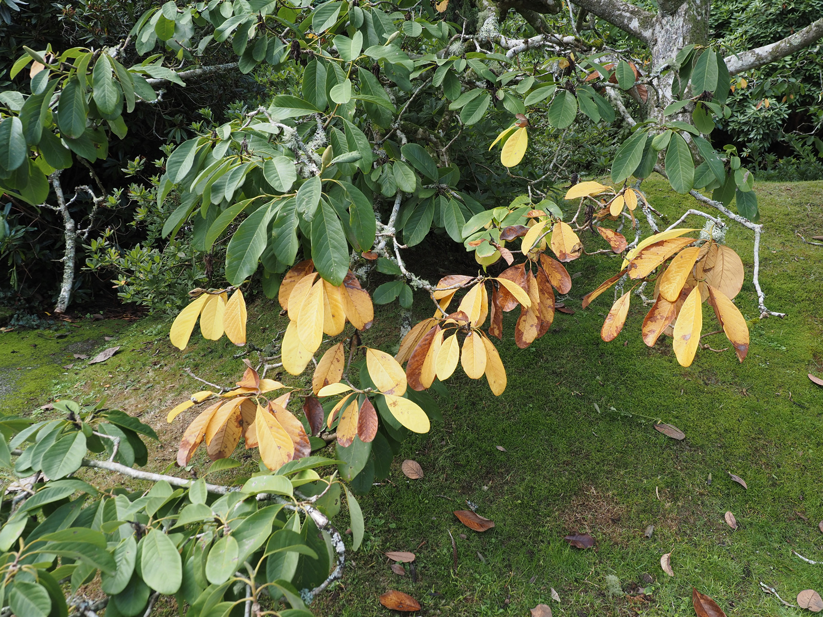
Yet again falling trees have opened up a new glade in the Japanese Garden.


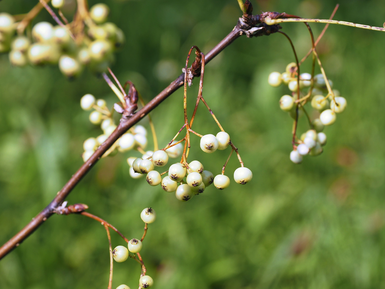
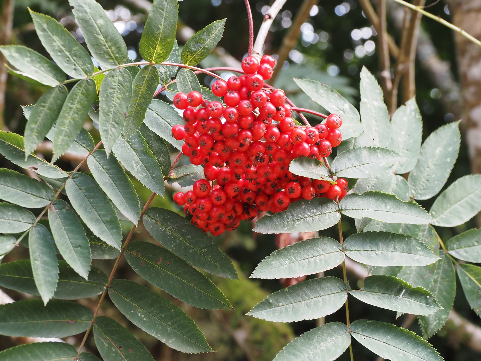
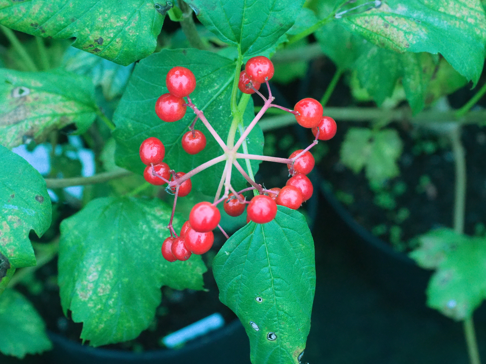
The 2014 planted Sorbus prattii is again loaded with white berries but only a small growing shrub.


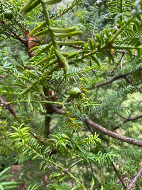
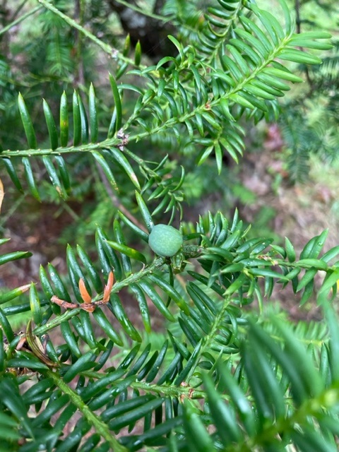
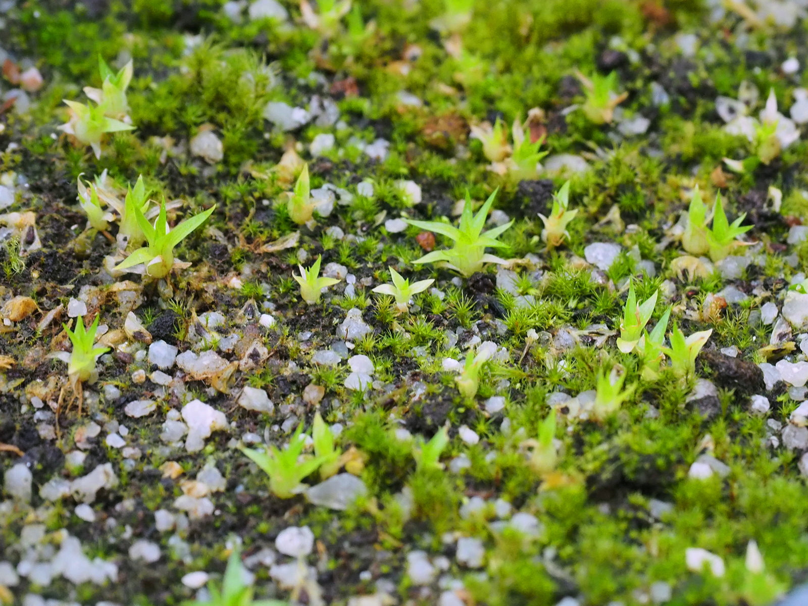
Just a few unripe seeds on Torreya taxifolia above Hovel Cart Road to complete our review of Torreya seeding for the year.


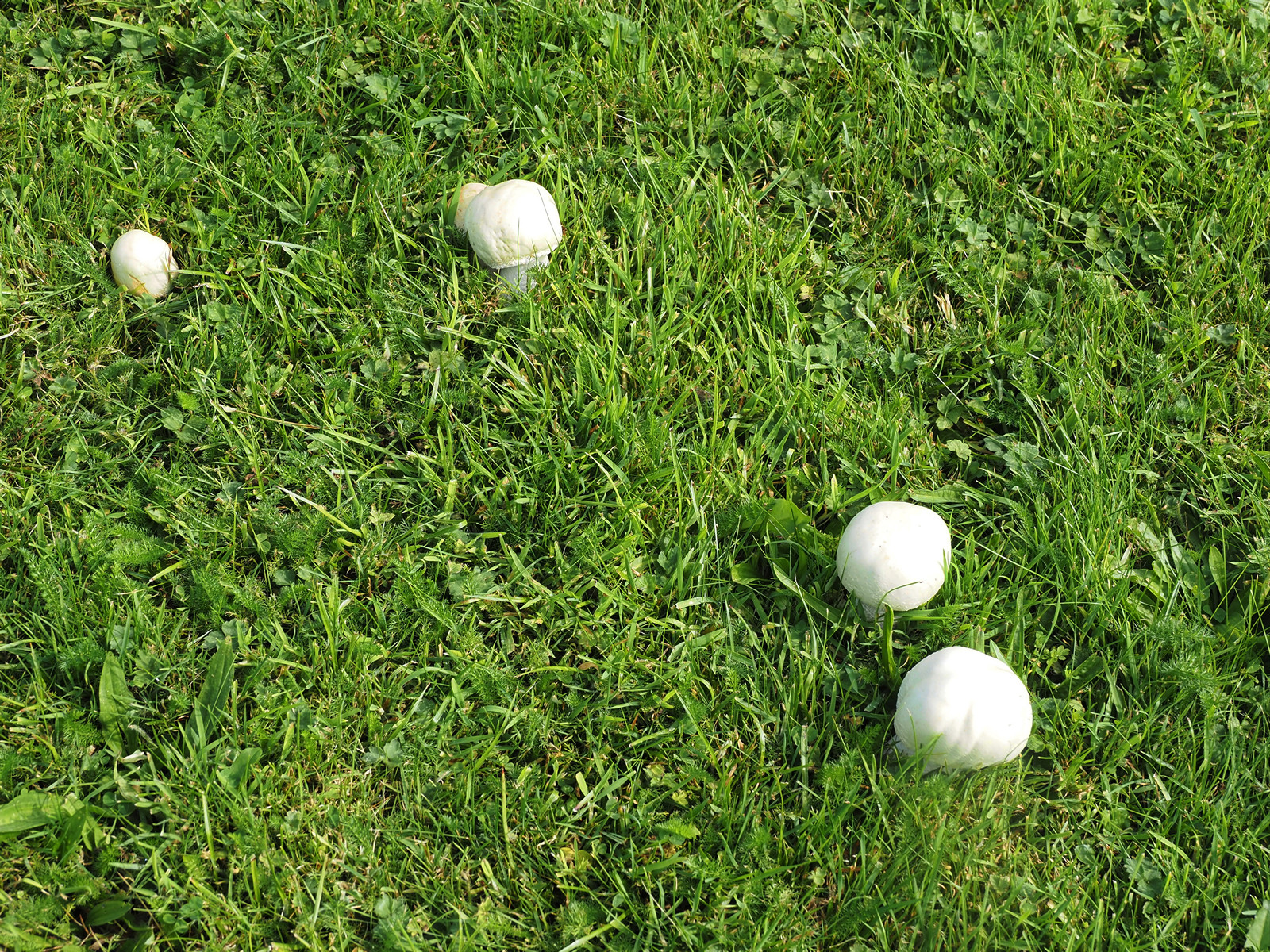
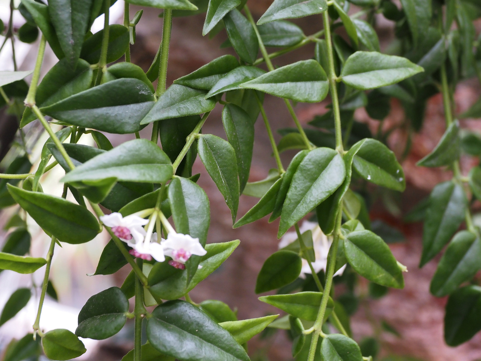
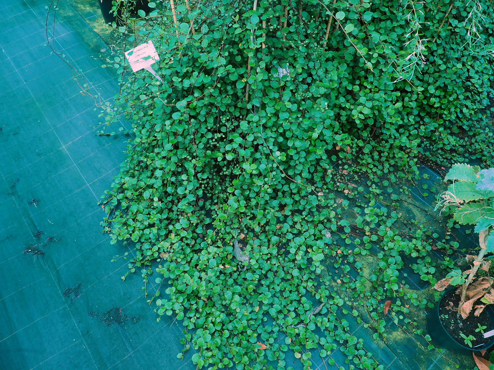
A nursery visit for meetings and autumn ‘move inside for the winter’ lists to sort out.Hoya lanceolata subsp. bella in flower.


2020 – CHW
I had vaguely promised to stop being critical about the economic suicide of lockdown some weeks ago. However, the latest arbitrary imposition of “only six” prompts me to return to the fray. The following is an amusing and highly revealing article about how the medical experts probably deliberately created the initial panic based on utterly false numbers:
The 1% blunder: How a simple but fatal math mistake by US Covid-19 experts caused the world to panic and order lockdowns
6 Sep, 2020 13:50
By Malcolm Kendrick, doctor and author who works as a GP in the National Health Service in England. His blog can be read here and his book, ‘Doctoring Data – How to Sort Out Medical Advice from Medical Nonsense,’ is available here.
In February, US Covid guru Anthony Fauci predicted the virus was ‘akin to a severe flu’ and would therefore kill around 0.1 percent of people. Then fatality rate predictions were somehow mixed up to make it look ten times WORSE.
When you strip everything else out, the reason for lockdown comes from a single figure: one percent. This was the prediction that Covid, if left unchecked, would kill around one percent of us.
You may not think that percentage is enormous, but one percent of the population of the world is 70 million people – and that’s a lot. It would mean 3.2 million Americans dead, and 670,000 Britons.
But where did this one percent figure come from? You may find this hard to believe, but this figure emerged by mistake. A pretty major thing to make a mistake about, but that’s what happened.
Such things occur. On September 23, 1998, NASA permanently lost contact with the Mars Climate Orbiter. It was supposed to go round and round the planet looking at the weather, but instead it hit Mars at around 5,000 mph, exploding into tiny fragments. It didn’t measure the weather; it became the weather – for a few seconds anyway.
An investigation later found that the disaster happened because engineers had used the wrong units. They didn’t convert pound seconds into Newton seconds when doing their calculations. Imperial, not metric. This, remember, was NASA. An organisation not completely full of numbskulls.
Now you and I probably have no idea of the difference between a pound second and a Newton second (it’s 0.67 – I looked it up). But you would kind-of hope NASA would. In fact, I am sure they do, but they didn’t notice, so the figures came out wrong. The initial mistake was made, and was baked into the figures.
Kaboom!
With Covid, a similar mistake happened. One type of fatality rate was substituted for another. The wrong rate was then used to predict the likely death rate – and, as with NASA, no-one picked up the error.
In order to understand what happened, you have to understand the difference between two medical terms that sound the same – but are completely different. Rather like a pound second or a Newton second.
Which fatality rate, did you say?
First, there’s the Infection Fatality Rate (IFR). This is the total number of people who are infected by a disease and the number of them who die. This figure includes those who have no symptoms at all, or only very mild symptoms – those who stayed at home, coughed a bit and watched Outbreak.
Then there’s the Case Fatality Rate (CFR). This is the number of people suffering serious symptoms, who are probably ill enough to be in hospital. Clearly, people who are seriously ill – the “cases” – are going to have a higher mortality rate than those who are infected, many of whom don’t have symptoms. Put simply – all cases are infections, but not all infections are cases.
Which means that the CFR will always be far higher than the IFR. With influenza, the CFR is around ten times as high as the IFR. Covid seems to have a similar proportion.
Now, clearly, you do not want to get these figures mixed up. By doing so you would either wildly overestimate, or wildly underestimate, the impact of Covid. But mix these figures up, they did.
The error started in America, but didn’t end there. In healthcare, the US is very much the dog that wags the tail. The figures they come up with are used globally.
On February 28, 2020, an editorial was released by the National Institute of Allergy and Infectious Diseases and the Centers for Disease Control and Prevention (CDC). Published in the New England Journal of Medicine, the editorial stated: “… the overall clinical consequences of Covid-19 may ultimately be more akin to those of a severe seasonal influenza.”
They added that influenza has a CFR of approximately 0.1 percent. One person in a thousand who gets it badly, dies.
But that quoted CFR for influenza was ten times too low – they meant to say the IFR, the Infection Fatality Rate, for influenza was 0.1 percent. This was their fatal – quite literally – mistake.
The mistake was compounded. On March 11, the same experts testified to Congress, stating that Covid’s CFR was likely to be about one percent, so one person dying from a hundred who fell seriously ill. Which, as time has passed, has proved to be pretty accurate.
At this meeting, they compared the likely impact of Covid to flu. But they used the wrong CFR for influenza, the one stated in the previous NEJM editorial. 0.1 percent, or one in a thousand. The one that was ten times too low.
Flu toll 1,000 – Covid toll 10,000
So, they matched up the one percent CFR of Covid with the incorrect 0.1 percent CFR of flu. Suddenly, Covid was going to be ten times as deadly.
If influenza killed 50, Covid was going to kill 500. If influenza killed a million, Covid was going to get 10 million. No wonder Congress, then the world, panicked. Because they were told Covid was going to be ten times worse than influenza. They could see three million deaths in the US alone, and 70 million around the world.
I don’t expect you or I to get this sort of thing right. But I bloody well expect the experts to do so. They didn’t. They got their IFR and CFR mixed up and multiplied the likely impact of Covid by a factor of ten.
Here’s what the paper, “Public health lessons learned from biases in coronavirus mortality overestimation”,says: “On March 11, 2020,… based on the data available at the time, Congress was informed that the estimated mortality rate for the coronavirus was ten-times higher than for seasonal influenza, which helped launch a campaign of social distancing, organizational and business lockdowns, and shelter-in-place orders.”
On February 28 it was estimated that Covid was going to have about the same impact as a bad influenza season – almost certainly correct. Eleven days later, the same group of experts predicted that the mortality rate was going to be ten times as high. This was horribly, catastrophically, running-into-Mars-at-5,000-miles-an-hour wrong.
Enter the Mad Modellers of Lockdown
In the UK, the group I call the Mad Modellers of lockdown, the Imperial College experts, created the same panic. On March 16, they used an estimated IFR of 0.9 percent to predict that, without lockdown, Covid would kill around 500,000 in the UK.
Is this prediction anywhere close?
So far, the UK has had around 40,000 Covid deaths. Significantly less than 0.1 percent, but not that far off. Of course, people will say… “We had lockdown… without it so many more would have died. Most people have not been infected…” etc.
To answer this, we need to know the true IFR. Is it a 0.1 percent, or one percent? If it is one percent, we have more than 400,000 deaths to go. If it is 0.1 percent, this epidemic has run its course. For this year, at least.
With swine flu, remember that the IFR started at around two percent. In the end, it was 0.02 percent, which was five times lower than the lowest estimate during the outbreak. The more you test, the lower the IFR will fall.
So where can we look to get the current figures on the IFR? The best place to look is at the country that has tested more people than anywhere else as a proportion of their population: Iceland.
As of last week, Iceland’s IFR stood at 0.16 per cent. It cannot go up from here. It can only fall. People can’t start dying of a disease they haven’t got.
This means that we’ll probably end up with an IFR of about 0.1 percent, maybe less. Not the 0.02 percent of Swine Flu – somewhere between the two, perhaps. In short, the 0.1 percent prophecy has proved to be pretty much bang on.
Which means that we’ve had all the deaths we were ever going to get. And which also means that lockdown achieved, almost precisely nothing with regard to Covid. No deaths were prevented.
Mangled beyond recognition
Yes, we are testing and testing, and finding more so-called cases. As you will. But the hospitals and ICUs are virtually empty. Almost no-one is dying of Covid anymore, and most of those who do were otherwise very ill.
Instead of celebrating that, we’ve artificially created a whole new thing to scare ourselves with. We now call a positive test a Covid “case.” This is not medicine. A “case” is someone who has symptoms. A case is not someone carrying tiny amounts of virus in their nose.
Now, however, you test positive, and you’re a “case.” Never in history has medical terminology been so badly mangled. Never have statistics been so badly mangled.
When researchers look back at this pandemic, they’ll have absolutely no idea who died because of Covid, or who died –coincidentally– with it. Everything’s been mashed together in a determined effort to make the virus look as deadly as possible.
Lockdown happened because we were told that Coivid could kill one percent. But Covid was never going to kill more than about 0.1 percent – max.
That’s the figure estimated back in February, by the major players in viral epidemiology. A figure that has turned out to be remarkably accurate. Bright guys… bad mistake.
We’ve killed tens of thousands – for nothing
But because we panicked, we’ve added hugely to the toll. Excess mortality between March and May was around 70,000, not the 40,000 who died of/with Covid. Which means 30,000 may have died directly as a result of the actions we took.
We protected the young, the children, who are at zero risk of Covid. But we threw our elderly and vulnerable under a bus. The very group who should have been shielded. Instead, we caused 20,000 excess deaths in care homes.
It was government policy to clear out hospitals, and stuff care homes with patients carrying Covid, or discharge them back to their own homes, to infect their nearest and dearest. Or any community care staff who visited them.
We threw – to use health secretary Matt Hancock’s ridiculous phrase – a ring of steel around care homes. As it turned out, this was not to protect them, but to trap the residents, as we turned their buildings into Covid incubators. Anyone working in care homes, as I do, knows why we got 20,000 excess deaths. Government policy did this.
That is far from all the damage. On top of care homes, the ONS estimates that 16,000 excess deaths were caused by lockdown. The heart attacks and strokes that were not treated. The empty, echoing hospitals and A&E units. The cancer treatments stopped entirely.
Which means that at least as many people have died as a result of the draconian actions taken to combat Covid, as have been killed by the virus itself. This has been a slow-motion stampede, where the elderly – in particular – were trampled to death.
We locked down in fear. We killed tens of thousands unnecessarily, in fear. We crippled the economy, and left millions in fear of their livelihoods. We have trapped abused women and children at home with their abusers. We have wiped out scores of companies, and crushed entire industries.
We stripped out the NHS, and left millions in prolonged pain and suffering, on ever lengthening waiting lists, which have doubled. There have also been tens of thousands of delayed cancer diagnoses – the effects of which are yet to be seen, but the Lancet has estimated at least sixty thousand years of life will be lost.
Lockdown can be seen as a complete and utter disaster. And it was all based on a nonsense, a claim that Covid was going to kill one percent. A claim that can now be seen to be utterly and completely wrong. Sweden, which did not lock down, has had a death rate of 0.0058 percent.
It takes a very big person to admit they have made a horrible, terrible mistake. But a horrible, terrible mistake has been made. Let’s end this ridiculous nonsense now. And vow never to let such monumental stupidity happen ever again.
The statements, views and opinions expressed in this column are solely those of the author and do not necessarily represent those of RT.
https://www.rt.com/op-ed/500000-covid19-math-mistake-panic/
The BBC take the line that the pandemic is unabated and continue to splurge out more lockdown propaganda. The facts, and in particular Sweden’s approach, make very clear that this is all nonsense, as do the minimal but underreported daily death totals.
2019 – CHW
To Burncoose to make a film about our new superfast broadband connections on the Burncoose estate with Openreach. It is a publicity film for them about connecting remote business pockets in the countryside and we have to keep quiet about all the hassle and delay with Openreach about their engineers and the final switch on. Seven people in the film crew plus a PR assistant. Two hours of my time may add 3.5 minutes to the film which may well be useful publicity for us.
While waiting I discover the following camellias have their first flowers in the tunnels:
Camellia “Winter’s Joy”


2018 – CHW
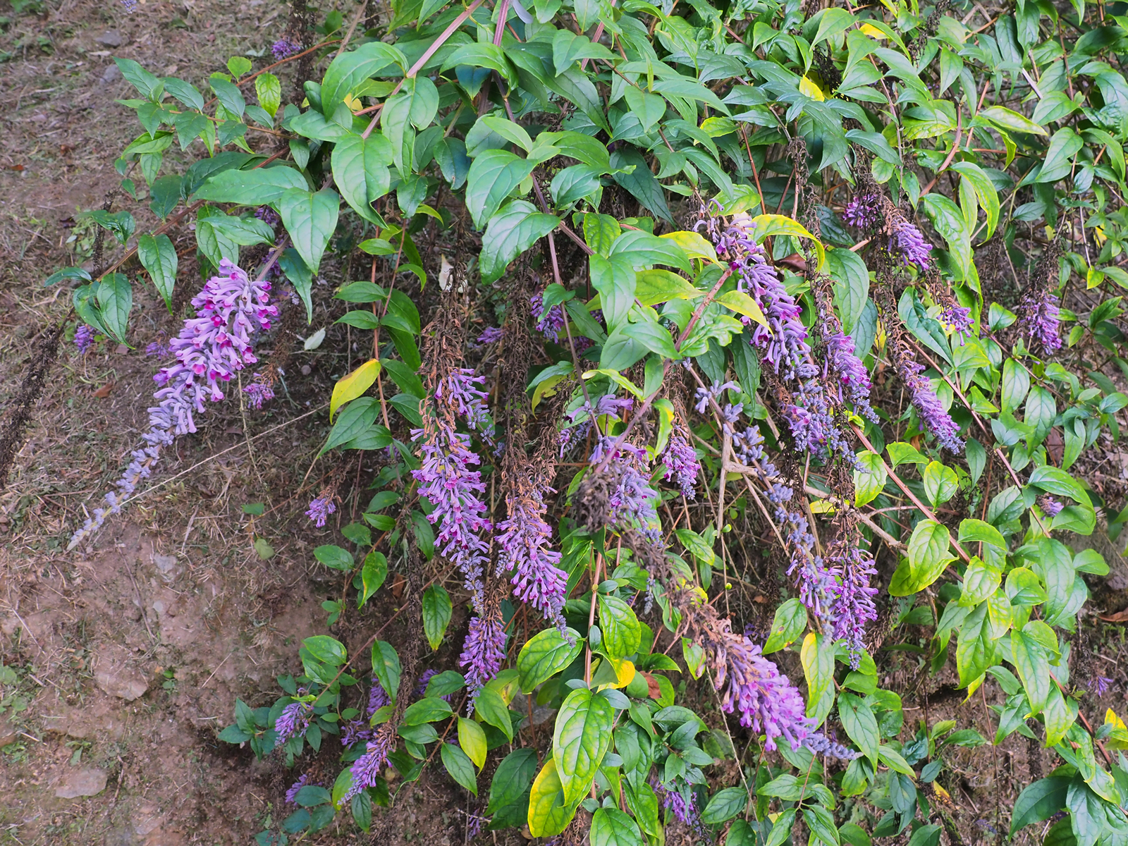
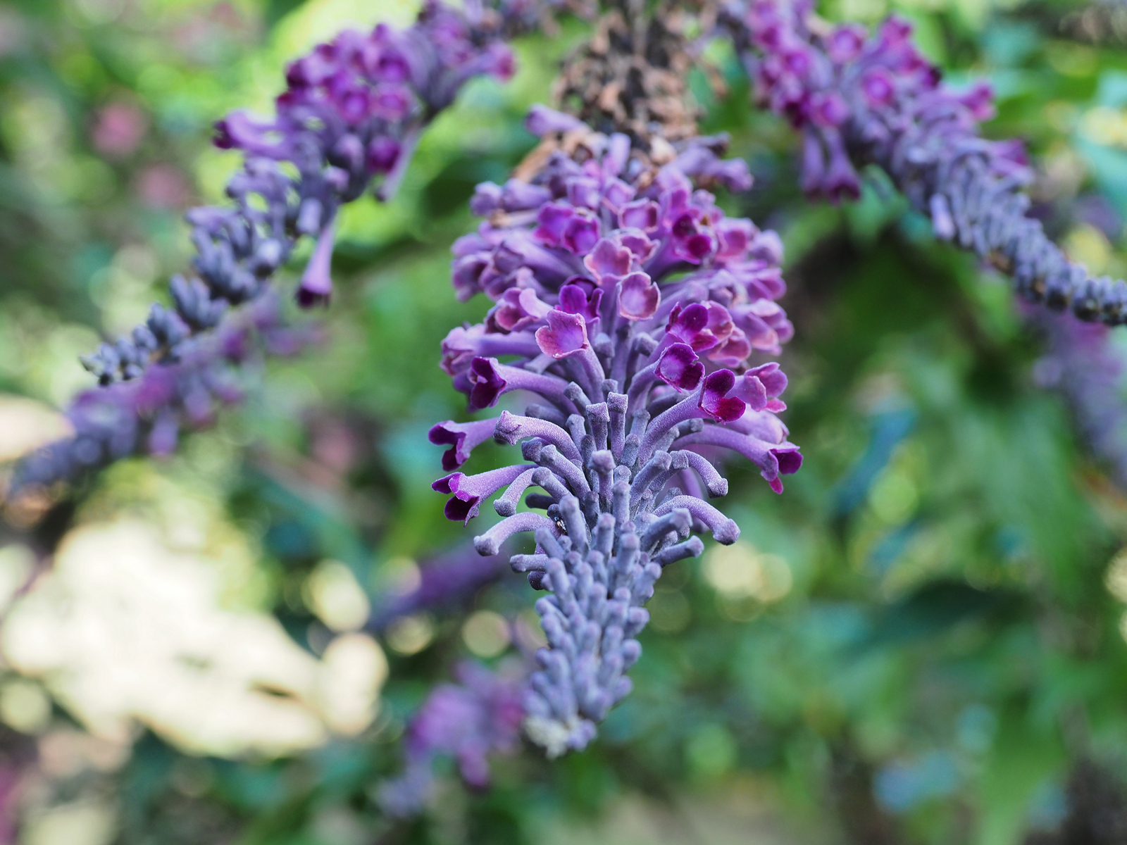
Buddleia lindleyana making its usual superb September show on the drive. The curved racemes of flowers hang over the drive and seem to have been showing colour for weeks. Probably at their best today.
A good crop of Rehderodendron macrocarpum seedlings in the greenhouse this year.
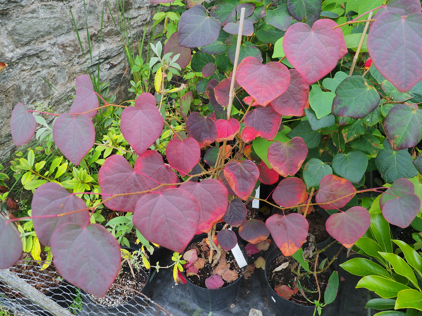
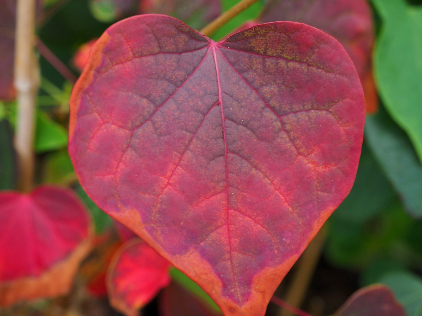

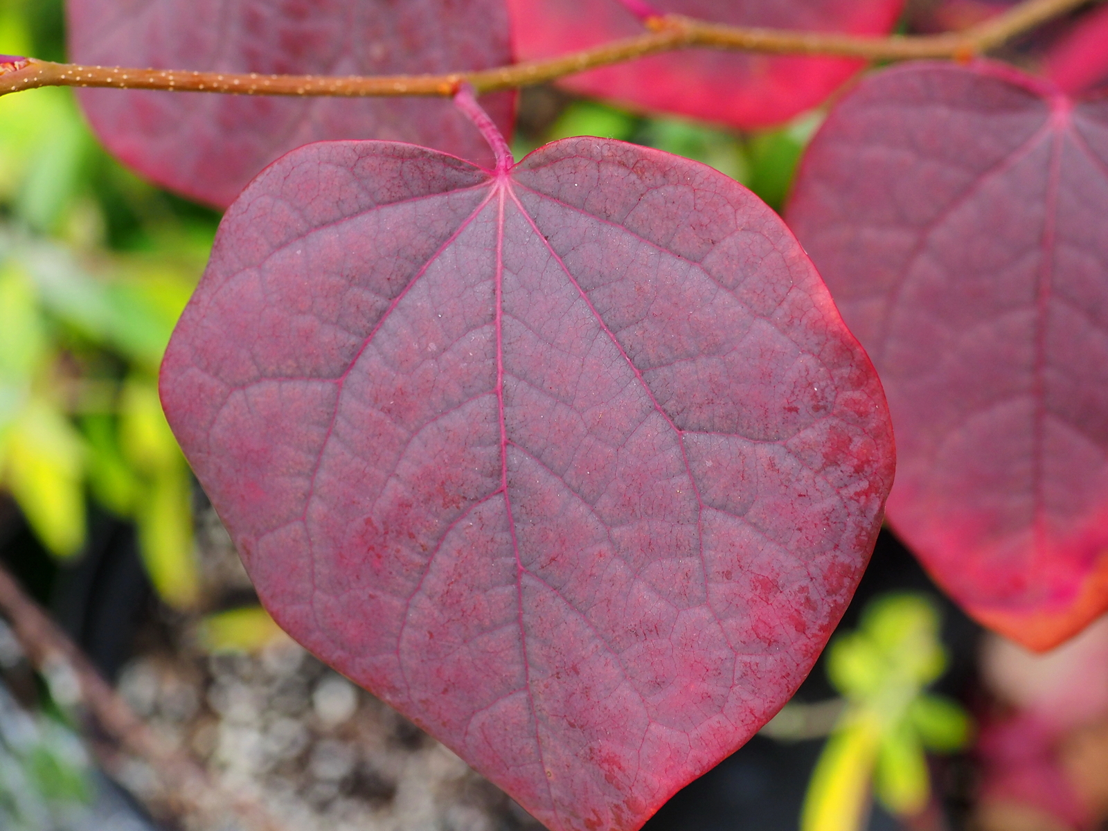

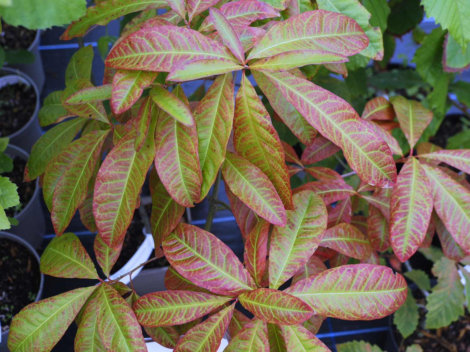
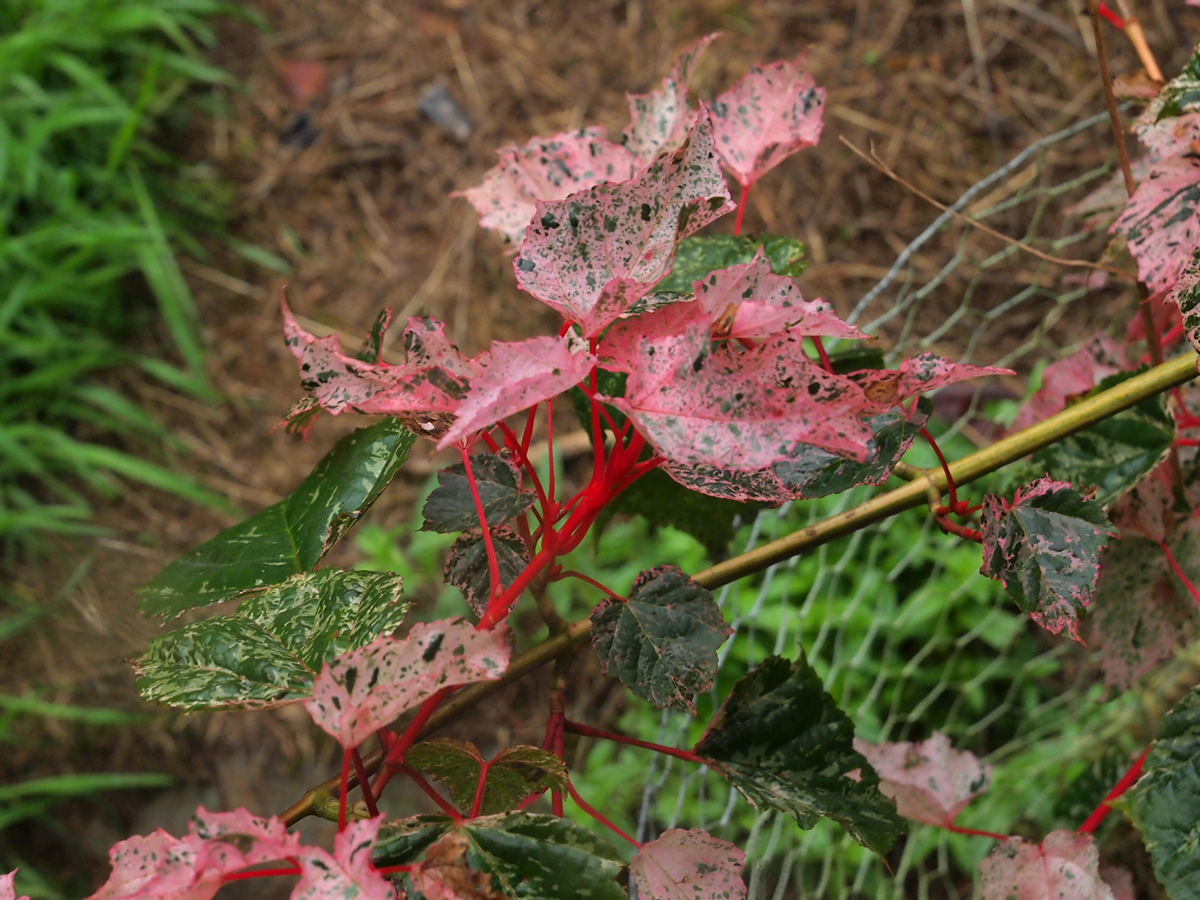
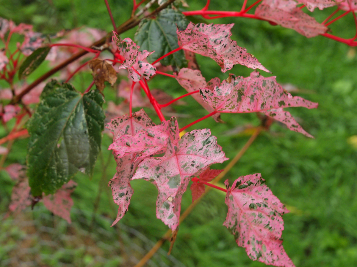
Acer x conspicuum ‘Red Flamingo’ stands out proud at this time of the year with its superb mottled new growth. Better even than the Acer x conspicuum ‘Phoenix’ at Burncoose which I showed to The Garden Society a year or two ago. Much more red and pink in the autumn flush. ‘Red Flamingo’ was a new introduction to us in 2015 and is one of those ‘must have’ plants to brighten up a drab early autumn day. The best thing I saw today starting to plan the camellia cutting programme for the next week or two. Remembering where all the new ones we all liked in the spring are is far from easy even with the planting plans. One casualty or a later addition to a planting plan can swiftly make the whole thing nonsense.
2015 – CHW
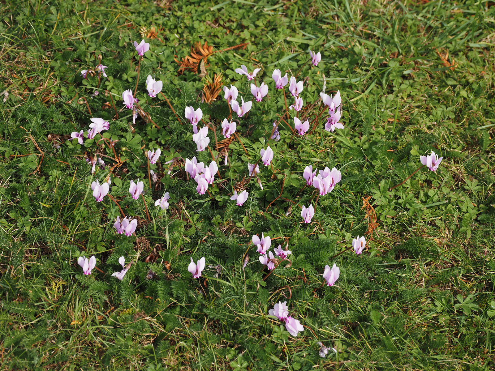
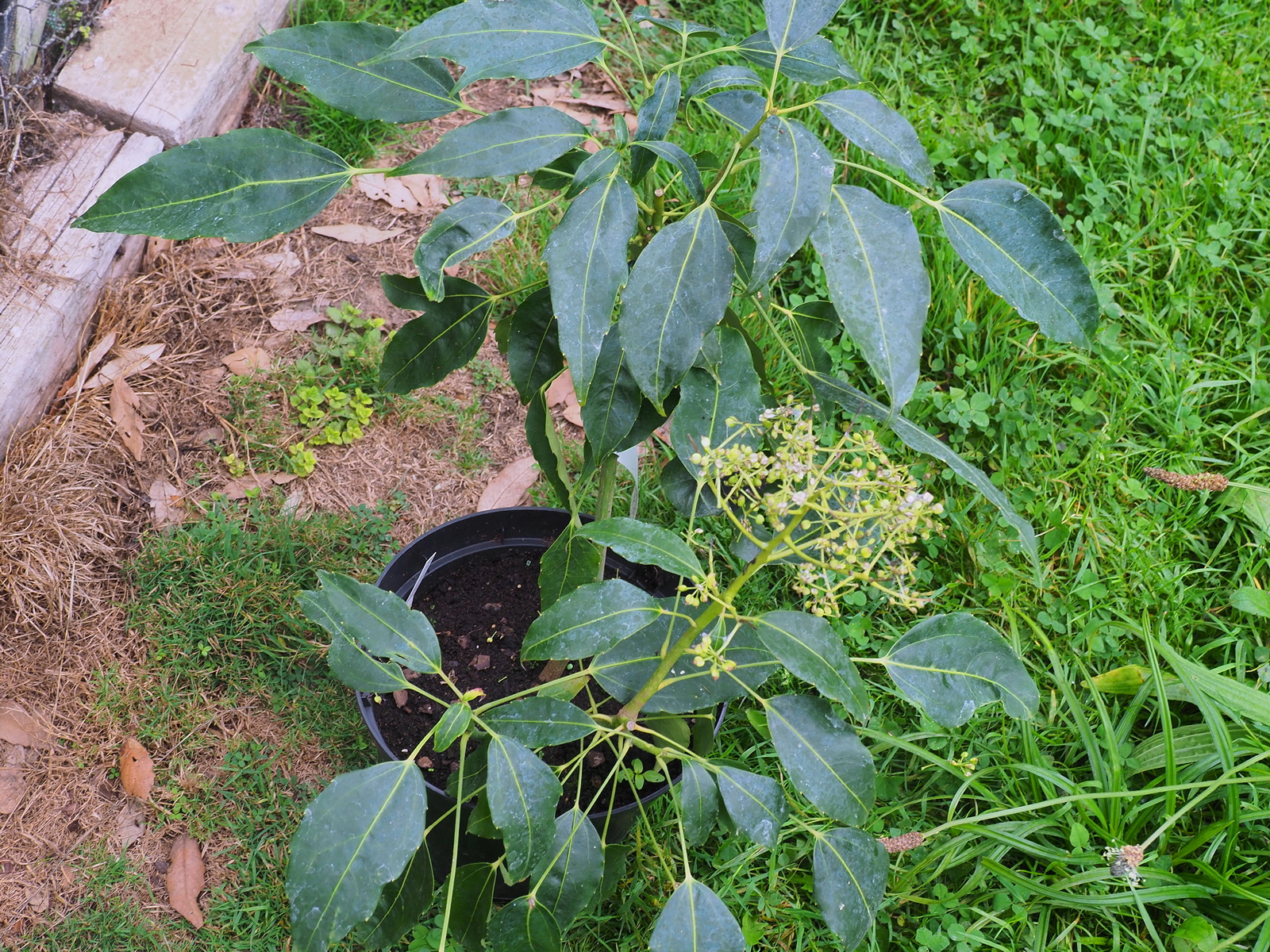
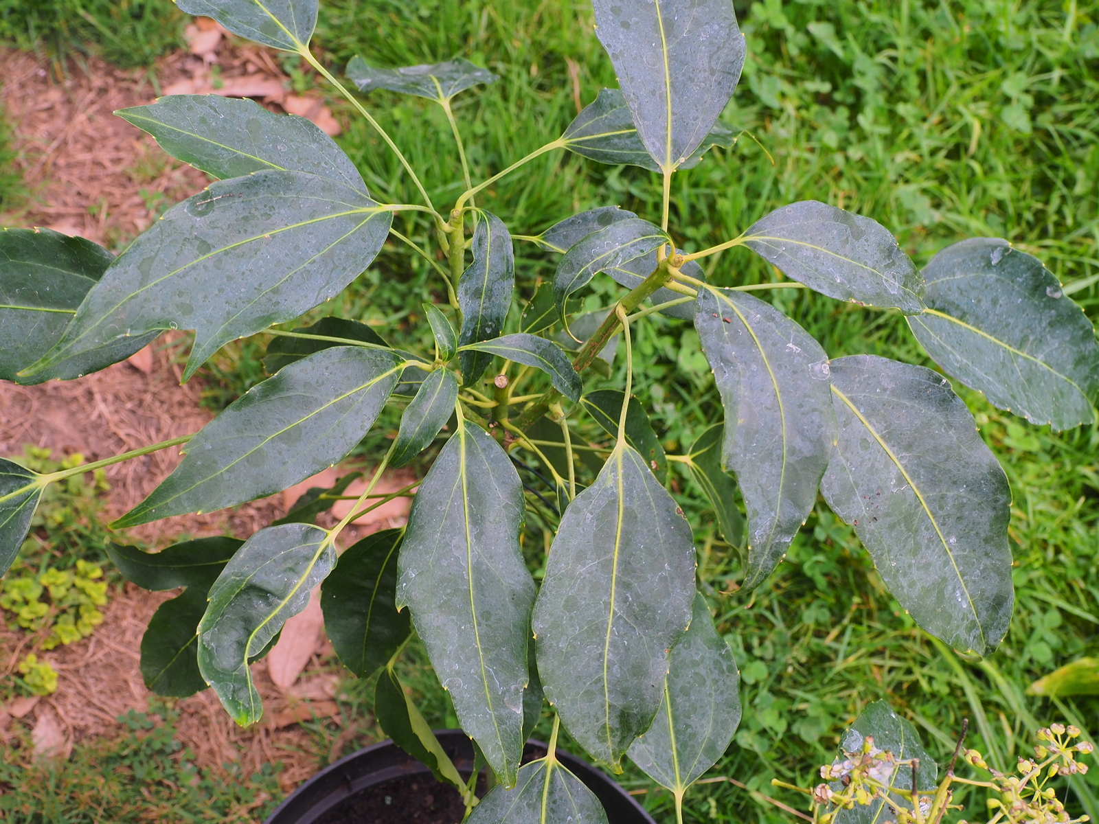
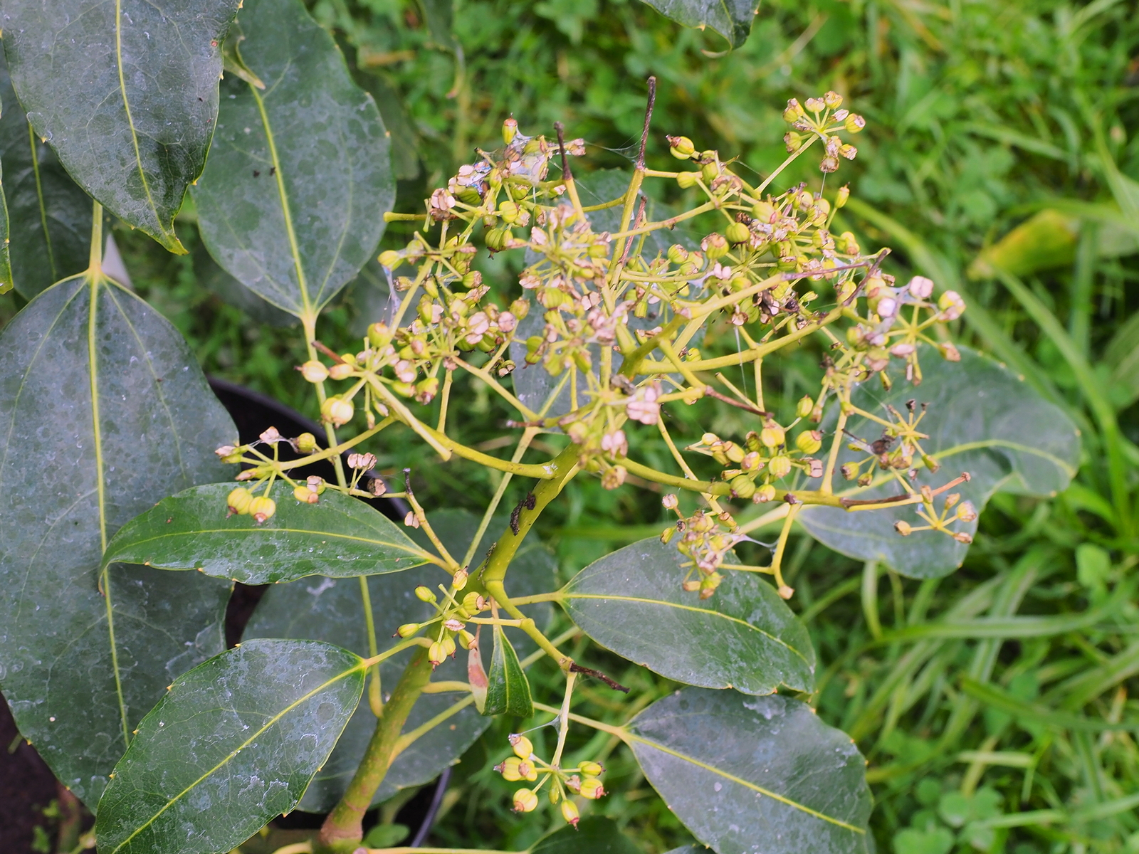
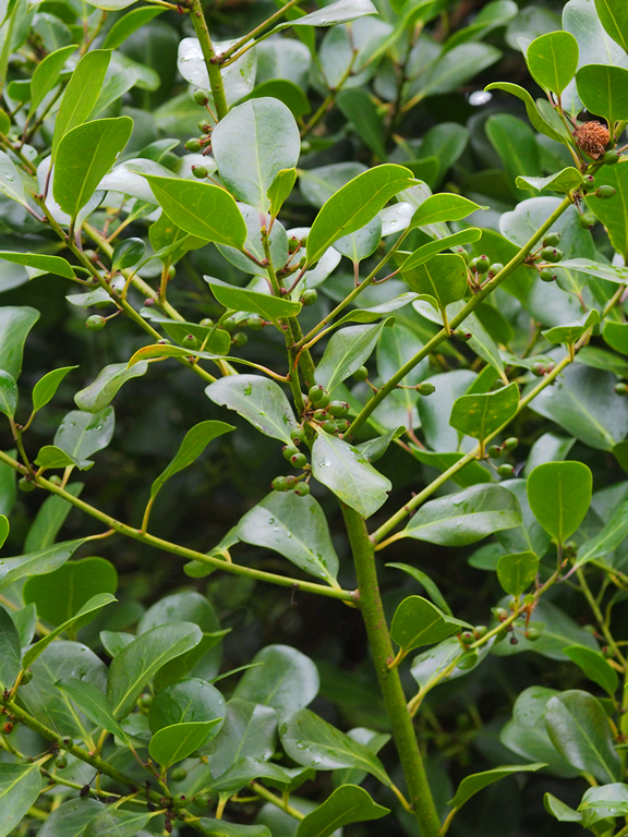
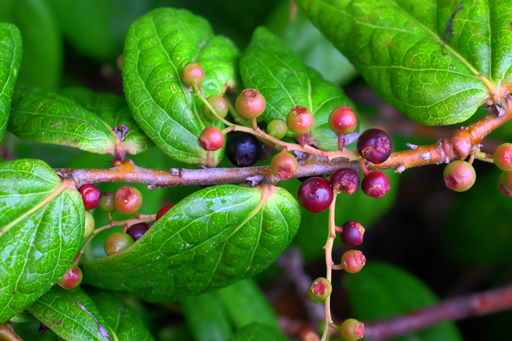
Ilex perado ‘Perado’ from the Canary Isles has been spread around the garden by birds feeding on its berries. This rare and rather dull species has one peculiar attribute in that, in spring, it has berries and flowers at the same time. The berries are usually solitary. Here they are not and the leaf shape suggests that this seedling may well in fact be a hybrid between Ilex perado ‘Perado’ and Ilex platyphylla. This may explain the large quantity of emerging berries.The berries on the very rare Vaccinum urceolatum are also changing colour but are not yet properly ripe.
1992 – FJW
Harvest finished, dry until.
1985 – FJW
Bad harvest. Nearly all finished. Bad summer – hyb’s yellow. First good leaves on Sinogrande. Beech trees look dreadful.
1963 – FJW
Harvest all but finished – very difficult for hay and corn. Weather for hay and rain laid corn flat.
1915 – JCW
Roses in the three beds, the cyclamen, the cassia and the hydrangeas are all good, have been crossing R primuliscum with R trichocladum, very hot and dry.